Color Collections
Choose a Collection
-
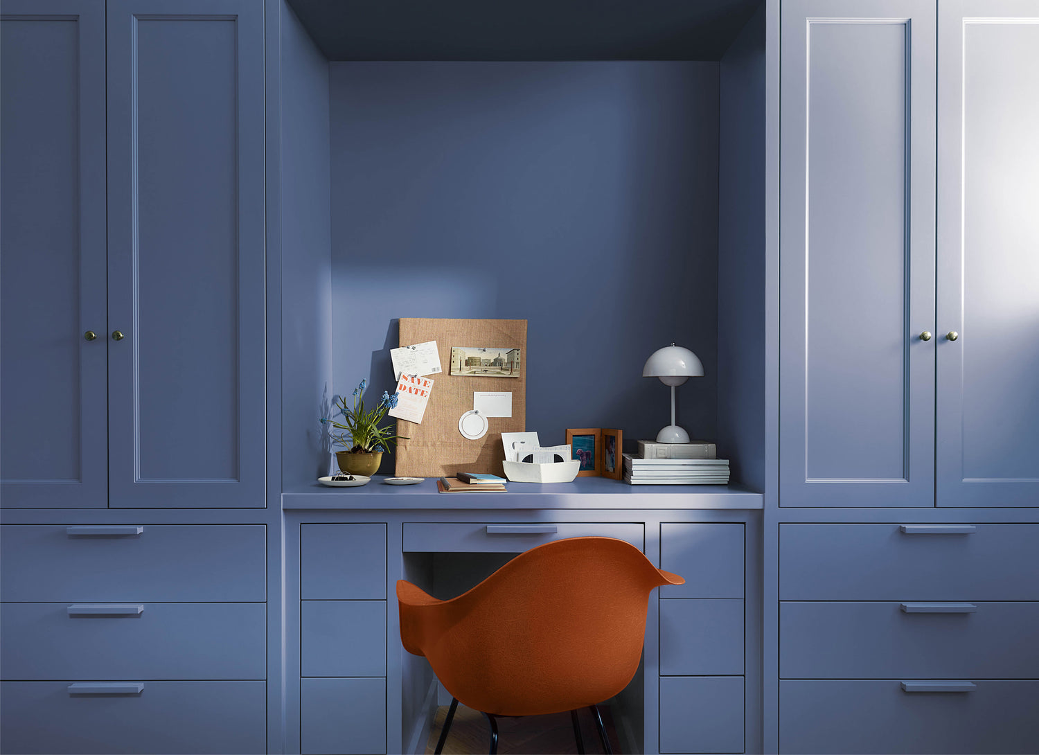
Color Trends 2024
Our Color Trends 2024 palette was chosen for its distinct presence and...
-
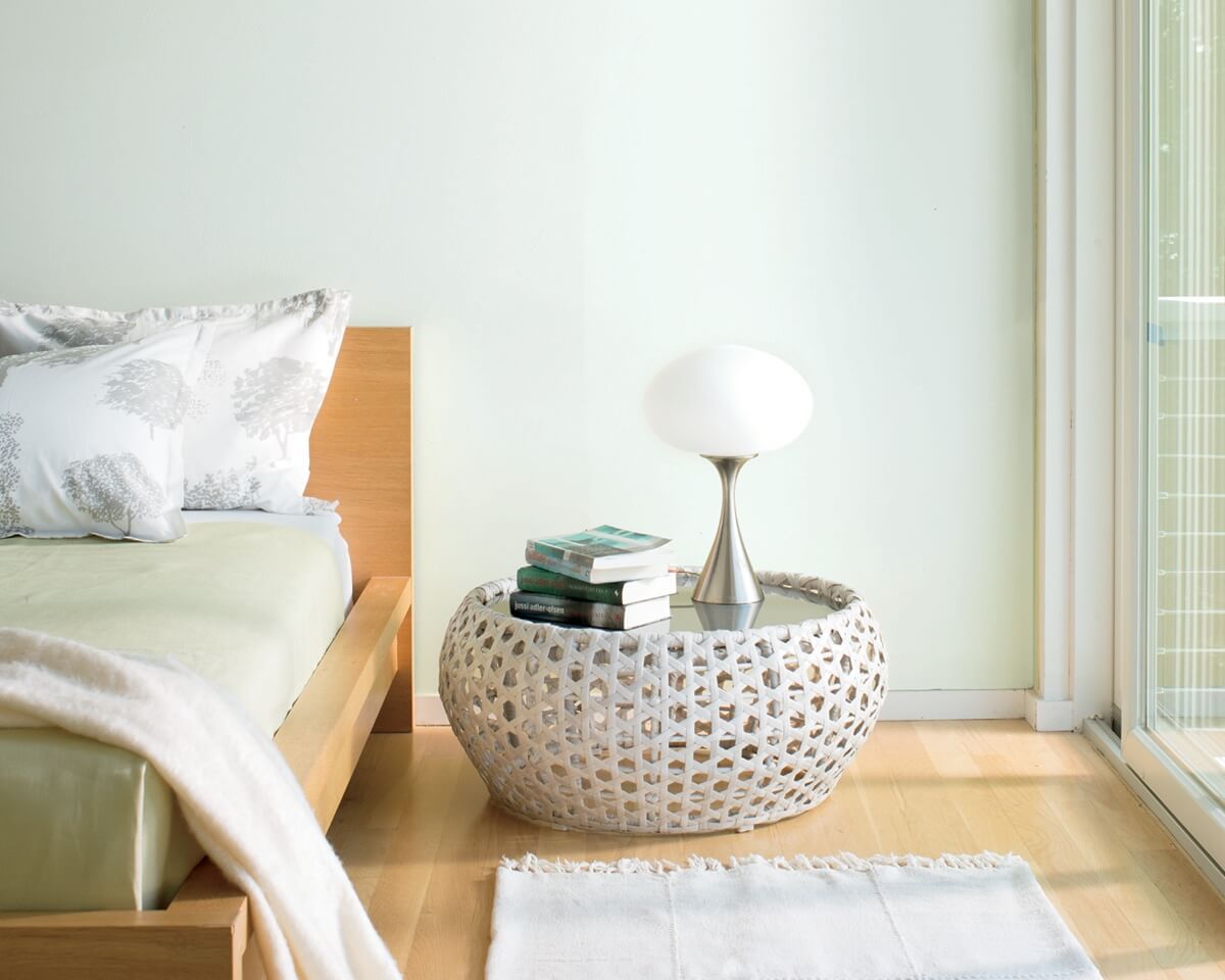
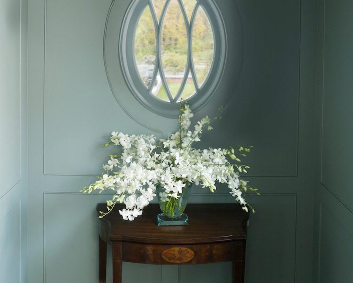
Color Preview®
From bold hues to airy pastels and saturated deeps, this color system...
-
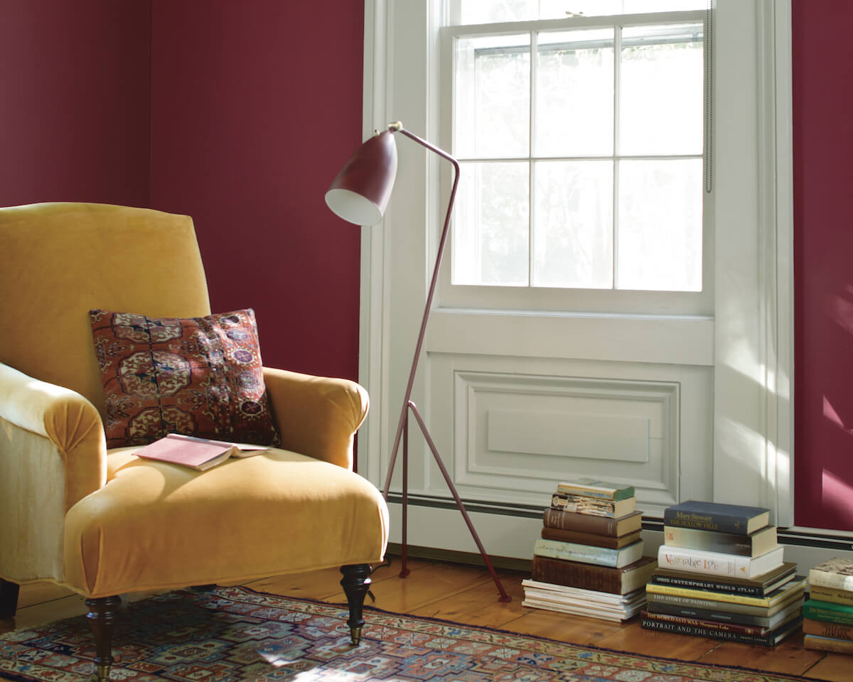
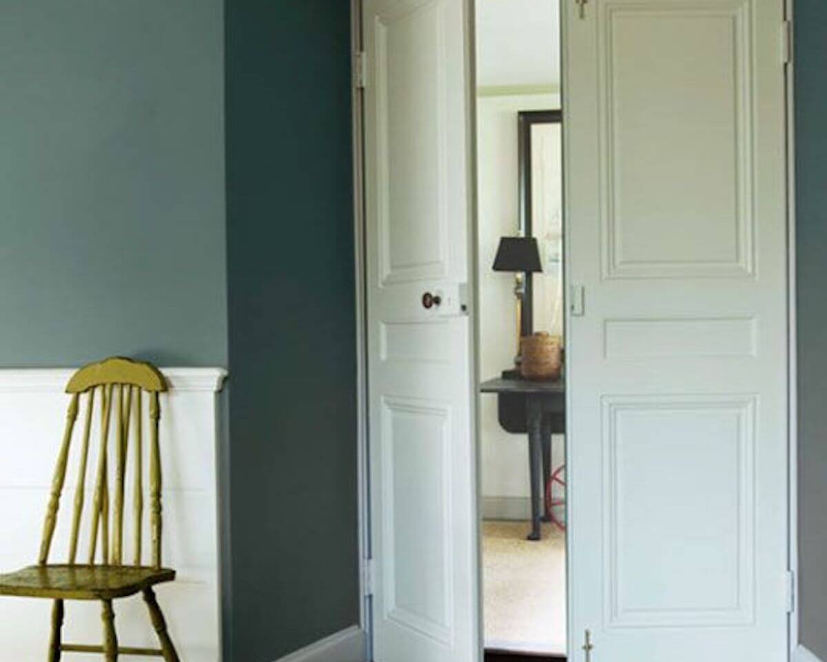
Benjamin Moore Classics®
These Benjamin Moore favorites with timeless appeal complement styles from traditional to...
-
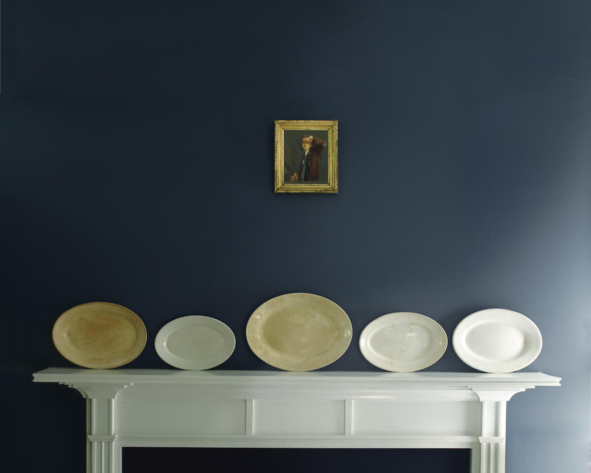
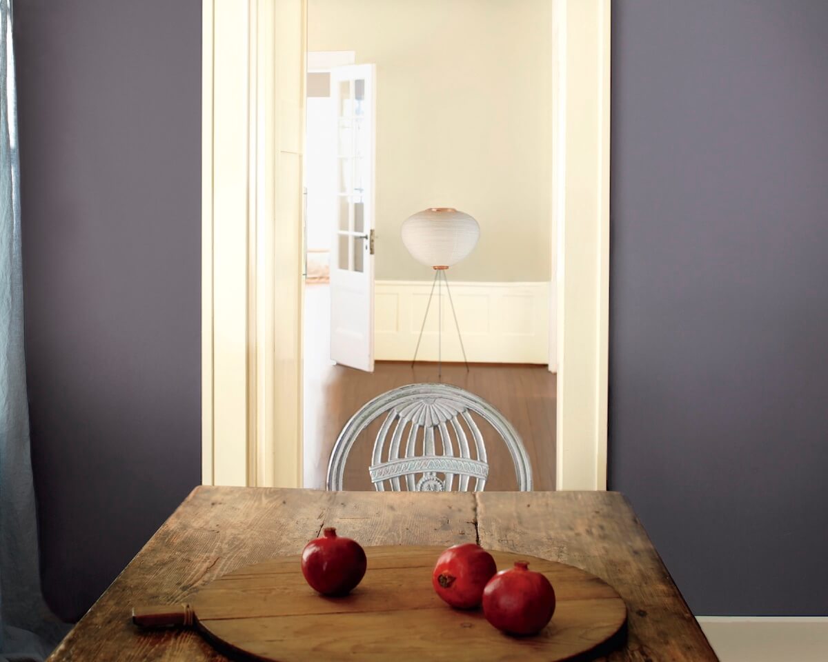
Historical Colors
191 colors inspired by America’s historic landmarks, the Historical Collection has become...
-
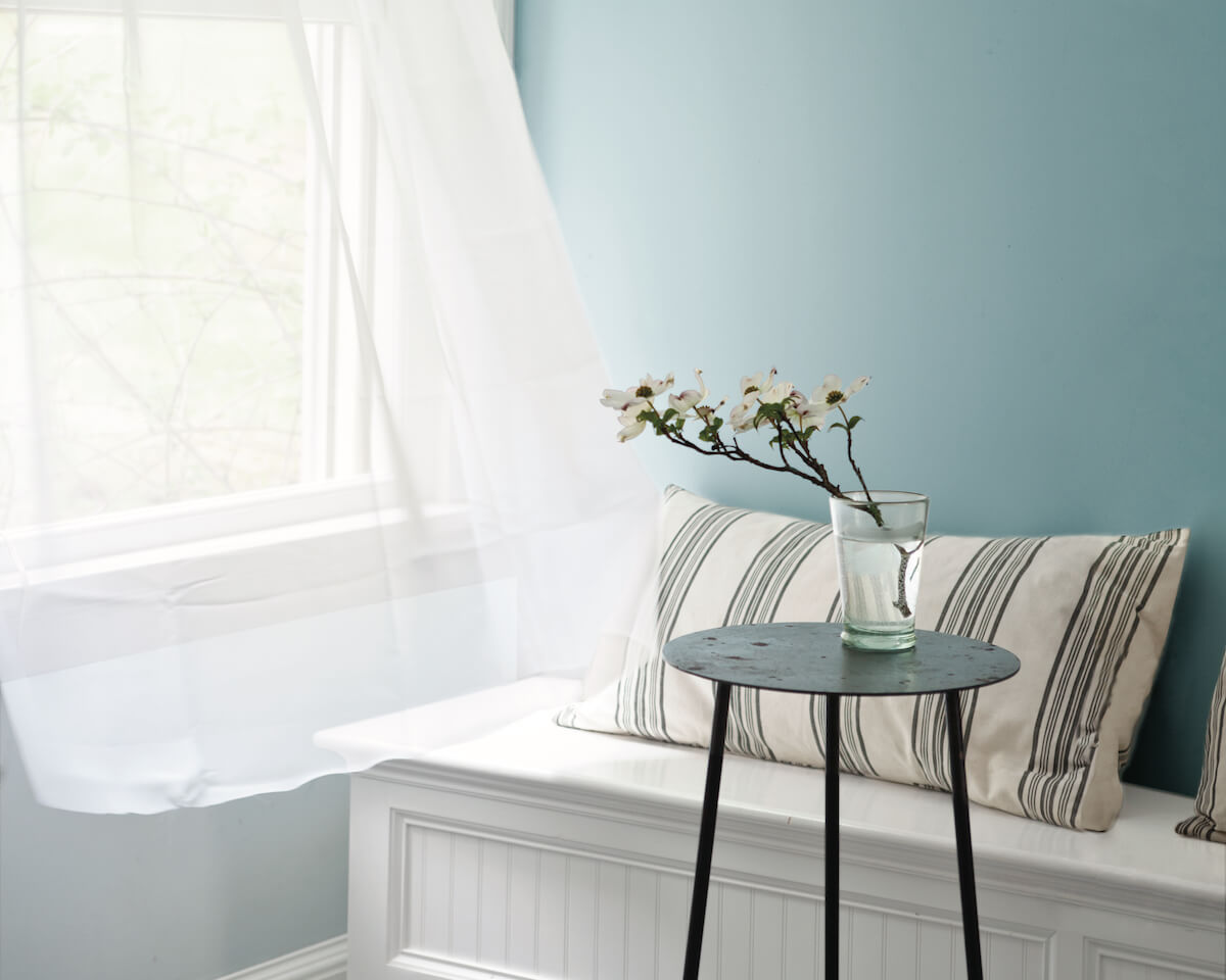
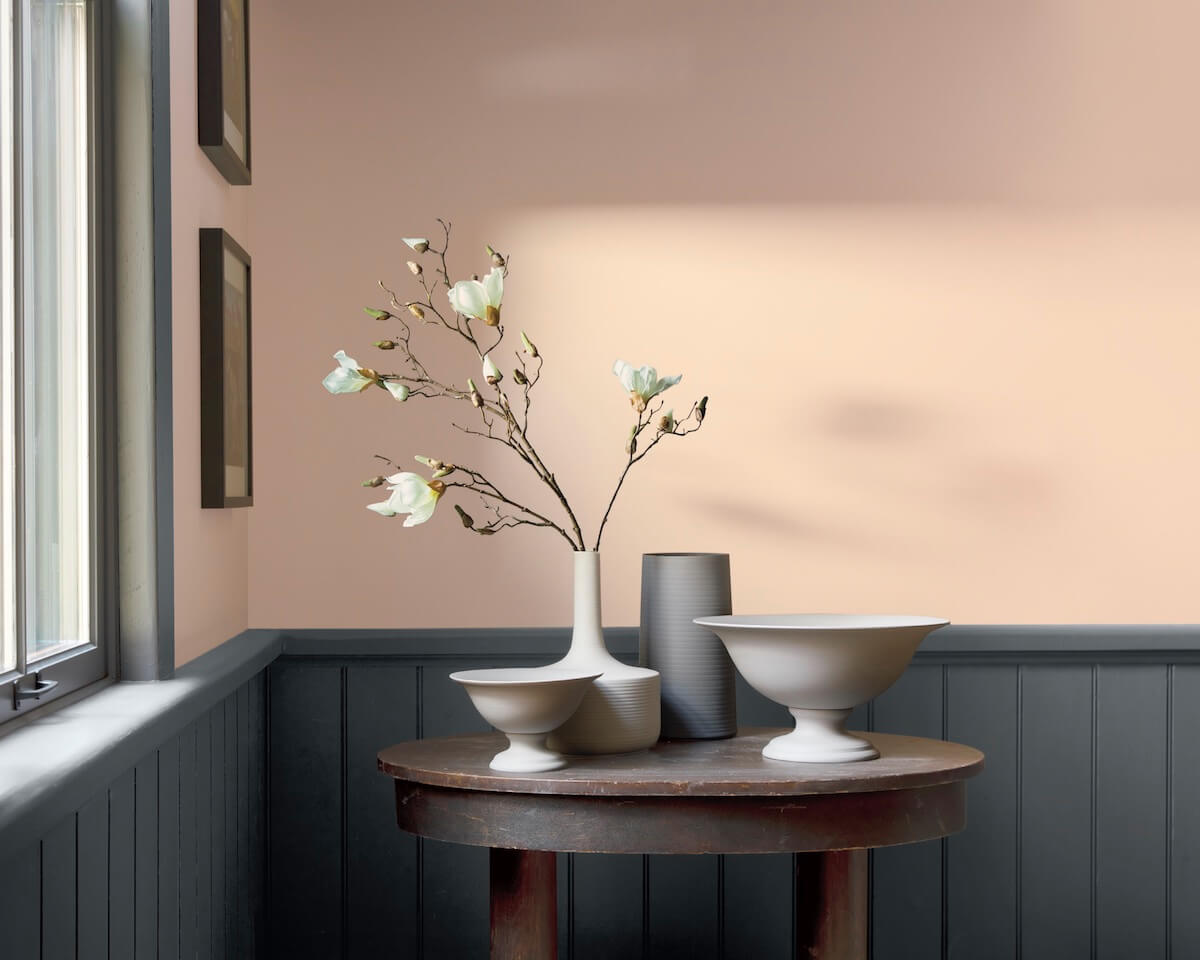
Off White Collection
Inherently sophisticated and endlessly versatile, the Off-White collection offers more than 150...
-
Affinity® Color Collection
The 144 colors of the Affinity® Collection are formulated to harmonize with...
-
Color Stories®
A series of striking hues crafted to take on different appearances as...
-
Williamsburg® Paint Color Collection
Trend meets tradition with 144 colors that enhance contemporary living.
-
America's Colors
42 soft hues inspired by the pale gray of our beautiful coastlines...
-
Designer Classics
231 tried-and-true, timeless colors, beloved by homeowners and professional designers alike.
-
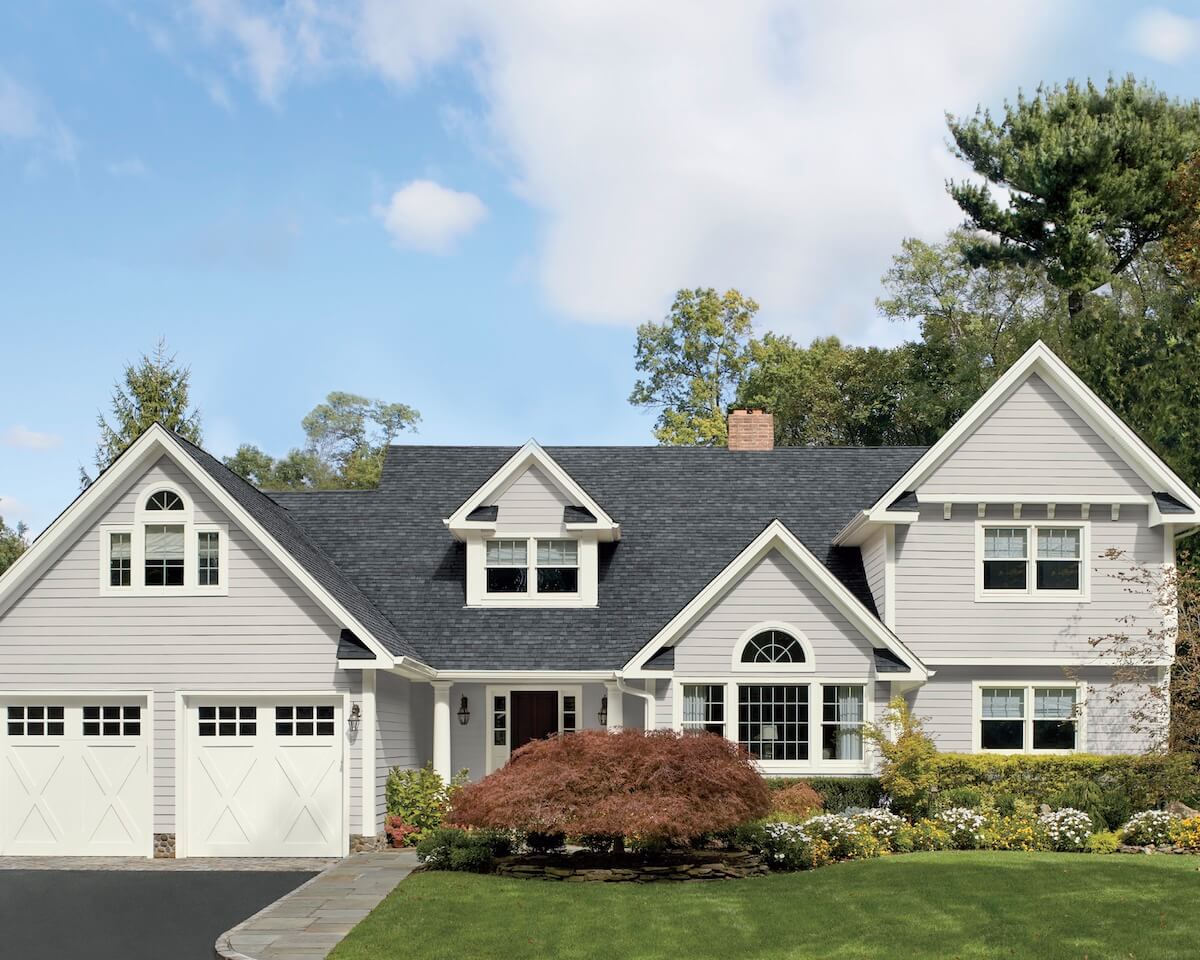
Colors for Vinyl
A curated palette of 75 colors for vinyl siding and trim for...
-
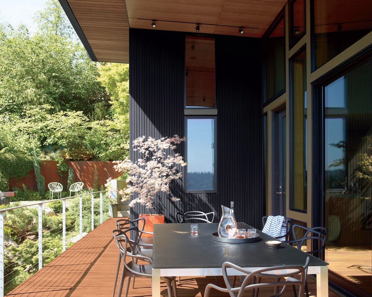
Arborcoat Stain Colors
Discover our curated palette of 75+ stain colors for decks, siding, and...


